Yes, absolutely. This functionality is CRUCIAL for people using Makeblock as a window into programming. Without that function, you’ve lost the central pillar that makes Scratch viable for new learners.
In the current version of Makeblock App, there is NO model for what a program should look like. There is NO observable model for how blocks should combine.
In the new version, the PLAY tools are static. There’s no way to see HOW they operate.
The EXPAND programs are static. They are control schemes for particular robots, but there’s no way to see HOW the cat shakes it’s head or how the robot chases the light.
The CREATE mode dumps new users into an empty screen. There are blocks on the left, but no guidance to how they work together.
Because I’ve used Makeblock for several versions, I have versions of the EXPAND projects saved in My Projects. I can’t create new ones. When working with my students, I can’t have them use a EXPAND project as the base for their own projects.
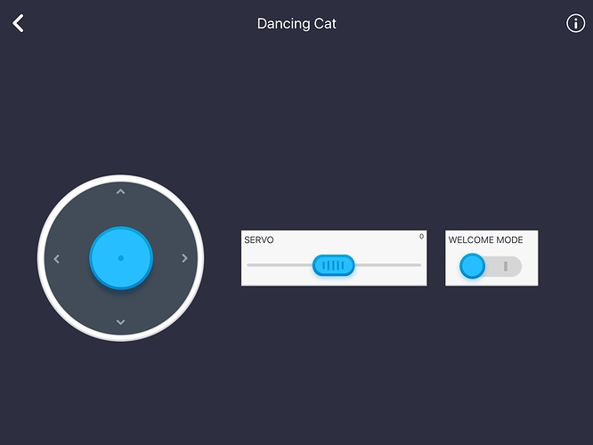
When you open the Dancing Cat project in the current version, this is what you see.
There’s no way to see HOW this program works. This a toy that you can play with until you’re bored, but never learn from.
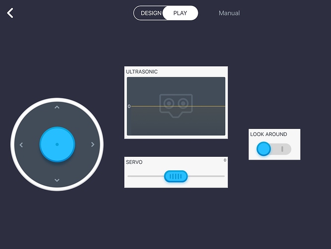
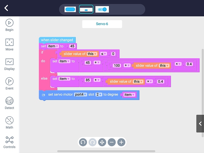
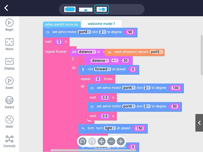
Because I previously made modifications of a Dancing Cat, I have a copy saved in My Projects. This is what ALL Expand projects should look like.
Same functionality, but with the Design/Play selector at the top.
Scratch is powerful because if you can PLAY the game, you can also look at how the game is DESIGNED, and make a copy of it to tinker with. Previous versions of Makeblock App followed that model. The new one DOES NOT, and it’s a huge mistake.
–andrew


